May , 13 2024
Is there an AI travel planner?
What if there was a way to streamline the process and make it more personalized than ever before? Imagine an…
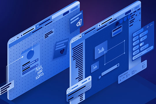
Navigating through Figma’s Adaptive Layout principles, ensuring a seamless responsive design process.
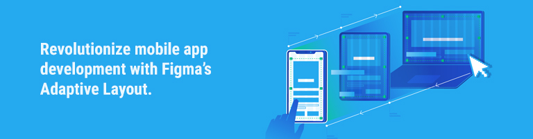
While creating a website, adaptive design is a must. It can provide you more control over how your website appears on various gadgets, like the iPad and iPhone.
There is a range of screen sizes available for iOS devices. It is crucial to make sure your programme functions flawlessly on each of these. If you want a larger audience to utilise your app, you should design your content so that it adjusts nicely to different screen sizes.
We discussed the significance of creating a layout that can adjust to different screen sizes in the section above, but what happens when the user moves from portrait to landscape mode or vice versa? Making ensuring your app supports both of these orientations is something else you’ll need to think about.
Why not make your app responsive for iPhone landscape mode as well, given that it is already iPad-adaptive? Given that most contemporary programmes are made with adaptable layouts in mind, this is a significant advantage with little work. In order to optimise content space, the status bar is hidden in landscape mode. The home indicator is now 23 points, the tab bar is 30 points, and the nav bar is 32 points.
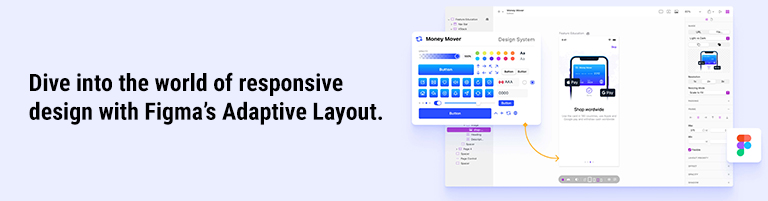
Specify the various frames you wish to employ with a responsive layout. Breakpoints are precise screen sizes at which your website’s layout will alter. You might wish to utilise a different layout, for instance, for a mobile screen, a tablet, and a large desktop screen.
Exploring how Figma allows developers to create adaptable components for diverse screen sizes.
Highlighting the collaborative prowess of Figma’s Adaptive Layout, facilitating real-time teamwork.
Enhanced Accessibility
Examining how Adaptive Layout Features contribute to making mobile apps more accessible to a wider audience.
Smooth Transitions and Animations
Leveraging Figma’s features for creating fluid transitions and animations, enhancing user engagement.
Cross-Platform Consistency
Ensuring a consistent user experience across various platforms through responsive design strategies.
How does Figma’s Adaptive Layout differ from traditional design tools?
Figma’s Adaptive Layout dynamically adjusts components based on screen dimensions, offering real-time responsiveness, unlike static designs.
Can Adaptive Layout Features be applied to existing projects?
Yes, Figma allows for the integration of Adaptive Layout into existing projects, providing a seamless transition to responsive design.
Is Figma suitable for small-scale app development?
Absolutely, Figma’s Adaptive Layout is scalable, making it an ideal choice for projects of all sizes, from small startups to large enterprises.
Do I need coding skills to utilize Figma’s Adaptive Layout Features?
No coding skills are required; Figma’s intuitive interface empowers designers to create responsive layouts without extensive coding knowledge.
How does Figma ensure collaboration in real-time?
Figma operates on a cloud-based platform, enabling multiple team members to collaborate simultaneously, fostering efficient real-time teamwork.
What sets Figma apart in terms of security for collaborative projects?
Figma employs robust security measures, ensuring the confidentiality and integrity of collaborative projects through secure cloud infrastructure.
In conclusion, Responsive Design for Mobile Apps, coupled with Figma’s Adaptive Layout Features, propels app development into a new era.
The synergy of flexibility, collaboration, and user-centric design makes Figma a standout choice. Embrace the future of mobile app development by integrating these innovative features into your projects.

What if there was a way to streamline the process and make it more personalized than ever before? Imagine an…

In the dynamic landscape of modern business, customer engagement stands as a cornerstone for success. With the evolution of technology,…

Users can select from a wide variety of applications in the competitive mobile application industry to find one that best…