May , 13 2024
Is there an AI travel planner?
What if there was a way to streamline the process and make it more personalized than ever before? Enter the…
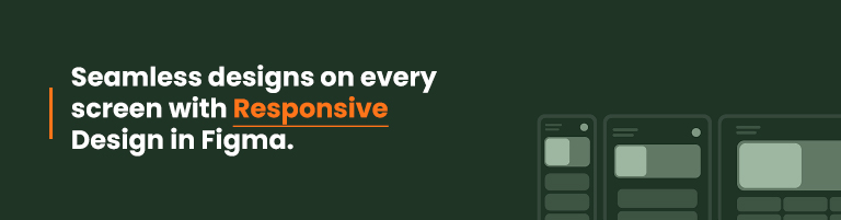
Figma’s responsive design is a game-changer in the always changing digital scene since it guarantees a smooth user experience on a variety of devices. The complexities of creating designs that go beyond screen borders and integrate the core ideas of accessibility and user-centricity are revealed in this blog
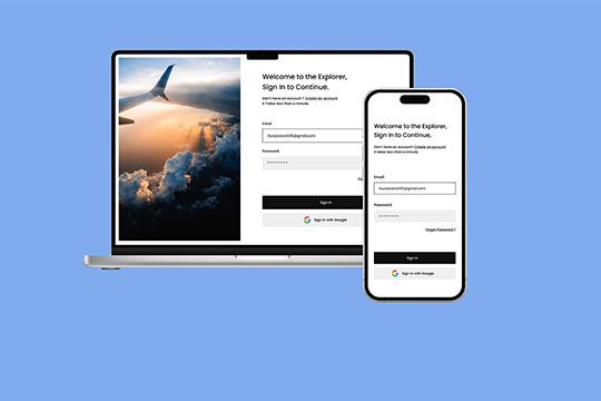
Responsive Design in Figma takes center stage as the foundation for creating versatile and adaptable interfaces. Harnessing the power of this design approach ensures your creations are not confined to a single device but resonate harmoniously across smartphones, tablets, and desktops.
Understanding the Core Principles
Delve into the fundamental principles that underpin Responsive Design in Figma. From fluid grids to flexible images, master the techniques that empower your designs to dynamically respond to varying screen sizes without compromising aesthetics.
Figma’s Role in Responsive Design
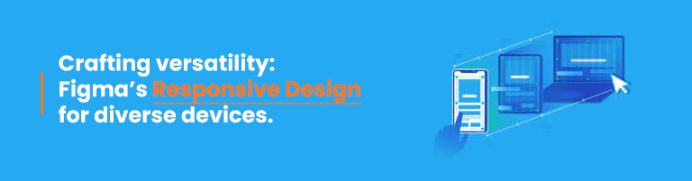
Unleash the full potential of Figma in realizing responsive designs. Navigate through Figma’s features designed explicitly for accommodating diverse screen dimensions, making the design process fluid and intuitive.
Embracing Mobile-First Design
Explore the significance of adopting a mobile-first approach in Responsive Design. Learn how starting with mobile optimization sets the stage for a seamless scaling-up process, ensuring a consistent and engaging user journey.
Media Queries: Tailoring Styles Responsively
Demystify the art of using media queries to tailor styles based on device characteristics. Elevate your design prowess by creating style rules that adapt dynamically, ensuring optimal user experiences on every device.
Collaborative Innovations
Discover how Ndimension Labs, a trailblazer in digital solutions, complements Responsive Design in Figma. Through collaborative innovations, they amplify the potential for creating designs that captivate across diverse digital landscapes.
Fostering User-Centric Solutions
Explore how Ndimension Labs integrates user-centricity into responsive designs. Their commitment to understanding user behavior enhances the adaptability of designs, resulting in compelling and intuitive digital experiences.
How does Responsive Design Impact User Engagement?
Responsive Design in Figma significantly enhances user engagement by providing a consistent and user-friendly interface across all devices. Users can seamlessly transition between devices without sacrificing the visual appeal or functionality of the design.
Can Figma Automatically Generate Responsive Designs?
While Figma doesn’t automate the entire process, it offers features and plugins facilitating responsive design. Designers can leverage constraints, auto-layout, and responsive design plugins to streamline the adaptation of designs to different screen sizes.
Is Responsive Design Limited to Web Design?
No, Responsive Design extends beyond web design. It encompasses various digital interfaces, including mobile applications and software interfaces. The principles remain consistent, focusing on adaptability across a spectrum of devices.
How Does Mobile-First Design Improve Performance?
Mobile-first design optimizes performance by prioritizing essential elements for smaller screens. This approach ensures faster loading times and a more streamlined user experience, contributing to improved overall performance.
Are There Limitations to Responsive Design in Figma?
While powerful, Responsive Design in Figma may face challenges with highly complex or intricate designs. Designers need to strike a balance between complexity and responsiveness, considering the limitations of certain design elements on smaller screens.
What Role Does User Feedback Play in Responsive Design?
User feedback is integral to the iterative process of Responsive Design. By collecting insights from users interacting with designs on various devices, designers can refine and enhance responsiveness, ensuring the end product aligns with user expectations.
Can Ndimension Labs Assist in Design Iterations Based on User Feedback?
Absolutely, Ndimension Labs values user feedback in the design process. They actively engage in iterative design based on user insights, ensuring the final product aligns seamlessly with user expectations.
A new age in digital encounters is being heralded by Figma’s use of responsive design and Ndimension Labs’ experience. Accept the tenets, make use of the resources, and think about collaborative creativity while creating ideas that cut across device barriers.

What if there was a way to streamline the process and make it more personalized than ever before? Enter the…

In the dynamic landscape of modern business, customer engagement stands as a cornerstone for success. With the evolution of technology,…

Users can select from a wide variety of applications in the competitive mobile application industry to find one that best…